How do you create the best landing pages for your Instagram ads?
In this guide we’ll walk you through Instagram landing pages, with our special expertise in the B2C advertising space.
We’ll cover:
- What are Instagram landing pages?
- What are the characteristics of a top-selling Instagram landing page?
- 25 Instagram B2C landing pages that make us go “whoa”
GET EARLY ACCESS TO NEW INSTAGRAM TOOLS FROM Customers.ai
Get more Instagram followers with new tools for influencers, artists, brands and D2C businesses. Sign up to be the first to use tools that generate elite engagement via Instagram DMs.
Get Early Access
What are Instagram landing pages?
Let’s start with the basics: What are they? And do they work?
A landing page is a page on your website designed to convert visitors into customers.
Prospects “land” on these pages after they click on one of your brand’s well-placed ads.
An Instagram landing page, naturally, is where you end up after you click on an Instagram ad.
The key characteristic of Instagram landing pages compared to not-Instagram landing pages is that Instagram landing pages must be formatted and sized for mobile.
Almost everyone who clicks on an Instagram ad is scrolling through their phone, so a landing page that’s not formatted for mobile is destined for failure.
That said, half of all web traffic worldwide comes from mobile devices (and that’s not counting tablets).
So really, all your landing pages should be programmed to look good on mobile.
Nevertheless, you came here in search of advice and inspiration to help you design an Instagram landing page that converts on sight. That’s exactly what we’re going to give you.
So, what happens after people click on your ads, and how can you make that experience better? And how are 25 of the experts doing it?
We’re glad you asked.
What are the characteristics of a top-selling Instagram landing page?
Your Instagram landing page matters because it sells your product — or doesn’t.
We’re assuming that at this point, your team has put a lot of time and effort into designing your Instagram ads.
As you should!
But what happens after people actually click on your shiny call to action (CTA) is even more important.
To put it simply, your Instagram landing page makes or breaks the sale.
It makes it easy for the prospect to see what you offer and why it matters…or it confuses the heck out of them, and they click away.
You may have heard that the human attention span is now about 8 seconds long.
That’s not actually true.
High-speed social media isn’t making humans dumber…it’s making us faster.
We’ve seen so many websites, ads, and sales pages that we’ve trained ourselves to find the important stuff as fast as possible.
If we can’t find what we’re looking for in about 15 seconds, we go somewhere else. That’s all there is to it.
So if you only have 15 seconds (or less) to engage prospects on your landing page, how do you do it?
Well, you have two options.
Instagram Landing Page Option #1: Create a no-nonsense landing page.
Simple. To-the-point. Easy to navigate.
Those are the hallmarks of a good landing page. You’ll see a lot of them in the 25 examples listed below.
But wait, before you skip to the pictures! There’s another, dare we say better, landing page format…
Instagram Landing Page Option #2: Send prospects straight to your inbox
Instead of sending people to a traditional landing page, try using Click to Instagram Direct ads. The point of the ad is to get viewers to direct message (DM) you for a special offer. The CTA is “Send Message.”
Why would you do this? You’d do this because ads that click to your DMs convert 5X to 10X better than traditional Instagram landing page ads.
A good traditional Instagram ad converts about 1% to 2% of people who see it. A good Instagram Direct ad converts about 10%.
Despite this, Instagram Direct ads are still rare. That’s because most companies don’t have the automation software available to manage hundreds of DMs flooding in every day.
Customers.ai changes that with an Instagram auto-reply bot that’s more than capable of closing the deal for you.
To see what it looks like, check out the examples below.
25 Instagram B2C landing pages that make us go “whoa” 😮
1. Customers.ai
Not to toot our own horn, but here’s an example of what a great Instagram Direct landing page can look like.
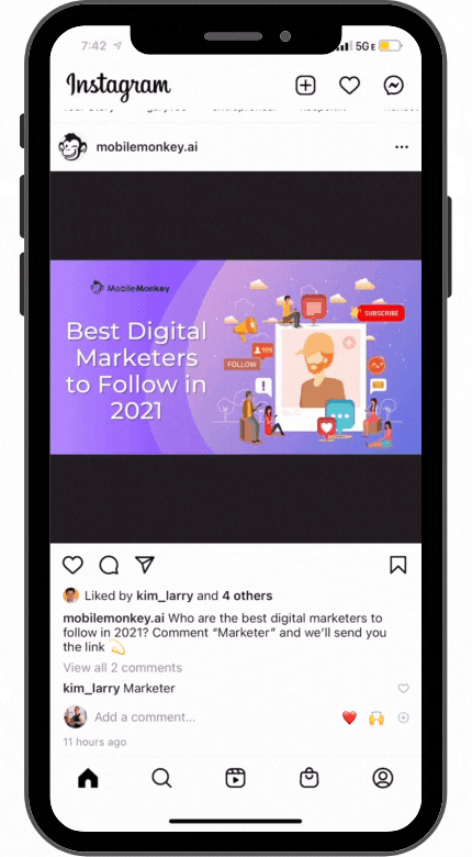
Clicking “Send Message” brings prospects straight to our inbox, where our auto-reply bot shows itself off. Then, we offer the prospect a chance to test our limited Instagram beta access.
If you want to see this ad in action, you can follow us on Instagram and hope the algorithm blesses you.
To experience our Instagram auto-reply chatbot, though, all you have to do is click “Message” on our profile and type “Start.” (Must be done on mobile.)
2. Wordstream
Okay, we’re cheating a little bit here — Customers.ai and Wordstream are B2B companies, not B2C. But we know WordStream to be one of the best ad companies out there and we heart their ad creative.
WordStream’s designs are some of the cleanest designs out there. Check out how simple the color scheme and call to action is.
Wordstream is offering advice about Google Ads, and all you have to do to get it is click “Download.”
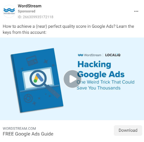
The landing page CTA is crystal clear: “Get The Guide.” And notice how it holds up equally well on both desktop and mobile.
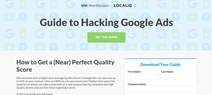
This is the sort of clarity all Instagram landing page ads should strive for.
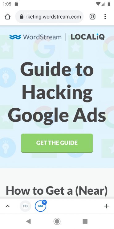
3. Sephora
Ads are made to sell your product. One of the simplest ways to do this is to…show us what you’re selling. Sephora does this well in this eye-catching (or should we say eyebrow-catching?) ad for eyebrow pencil.
The CTA says “Shop now!” And it does what it says on the tin. Clicking through brings you straight to the product page for Sephora’s Charlotte Tilbury line.
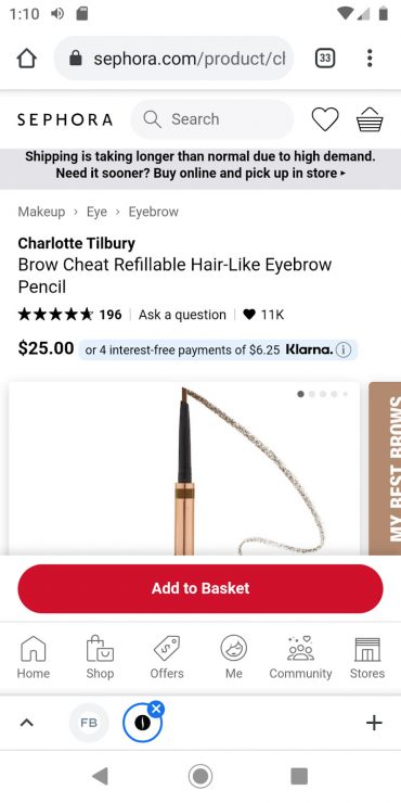
As soon as you land, you’ve got the option to “Add to Basket.” Someone could click through this ad and buy the product in a matter of seconds.
Major props to Sephora for creating a near-frictionless sales funnel!
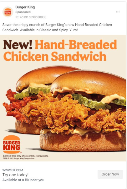
4. Burger King
When Burger King rebranded, designer Jones Knowle Ritchie created the custom typeface Flames Sans to “[evoke] the natural, organic shapes of food.” They’ve kept this consistent in their branding.
In this ad, Burger King shows off their new chicken sandwich. If that makes your mouth water, your next step is clear: click the “Order Now” CTA!
Clicking on it brings you straight to Burger King’s menu. You have the option to scroll through your options, or you can click “Order in app.” You’re also able to “Sign Up” in the top right.
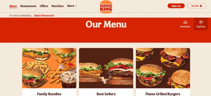
Burger King could try A/B testing an Instagram Direct ad instead…for example, by offering a discount code to anyone who messages them “MY WAY.”
Either way, this ad is a good example of keeping your sales funnel simple and your branding consistent.
5. HelloFresh
If you’re subscribed to any YouTube influencer channels, you’ve heard of HelloFresh.
This meal kit service sends easy recipes and pre-measured portions to its subscribers…a lifesaver for anyone stuck at home with only a limited knowledge of the kitchen.
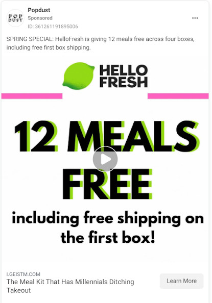
This ad’s doing a couple things at once. First, it’s offering 12 free meals. That’s an eye-catching offer.
And if you look closer, you can see that this ad is actually a sponsored post.
Popdust, an entertainment news brand, is promoting this post to their 12,000+ followers.
A large number of these followers are likely millennials or older Gen Z’s, who are the perfect audience for HelloFresh’s meal kits.
(Yes, you heard that right…Gen Z is old enough to order meal kits now. Oof.)
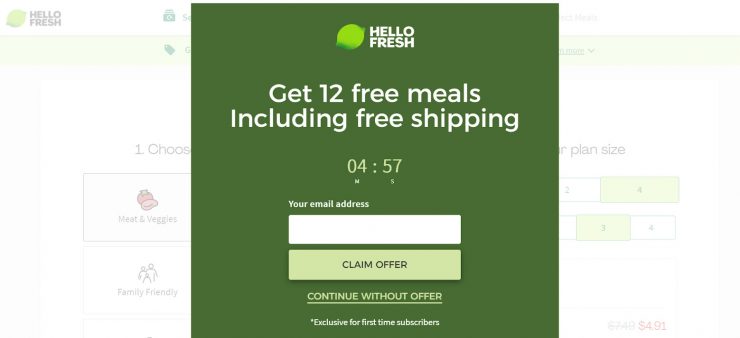
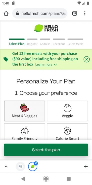
A banner across the top of the landing page advertises the exact same thing, with the CTA “Learn More.” Since the main CTA and the goal of the ad is “Select this plan,” this is an interesting choice.
HelloFresh could A/B test removing that banner to see whether its presence affects sales.
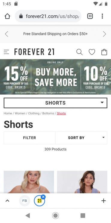
6. Forever21
Forever21 keeps up its youthful branding with a play on words: “Longer Days, Shorter Styles.”
Interested prospects can click the “Shop Now” button to shop the summer shorts collection.
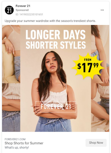
As you might expect, clicking through brings you to a product page.
This is a good strategy for e-commerce companies, whose loyal customer bases have one goal: buy more cool stuff.
A top banner advertises free standard shipping on orders over $50, while another banner ad offers 15% off and 10% off codes.
While that offers great value, it makes the layout a little confusing.
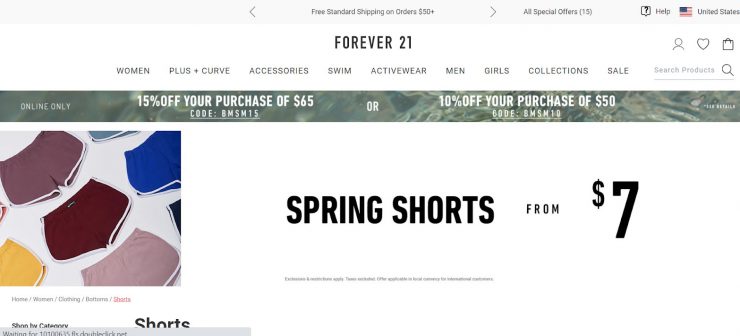
It’s not as easy to make a purchase through this ad as it is with Sephora’s example from earlier. Forever21 could experiment with less banners and a bold landing page CTA.
Also, a discount code is always a good opportunity to use Instagram Direct ads.
Forever21 could invite their prospects to message the company for 15% off. Since the prospect would enter their email address to get this code, it’d also double as a lead gen strategy.
Overall, this ad is eye catching and the landing page is easy to use. With a few tweaks, it’s a great example for e-commerce brands to follow.
7. Dollar Shave Club
This ad is part of a series of Dollar Shave Club’s social proof ads. (If you want, you can check out the rest on the Facebook Ad Library.)
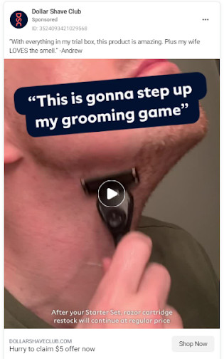
Ads like this both showcase the product and show people that your current customers are having a blast!
Clicking “Shop Now” brings you to a very straightforward landing page. It’s actually similar to the WordStream example from earlier.
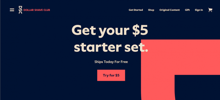
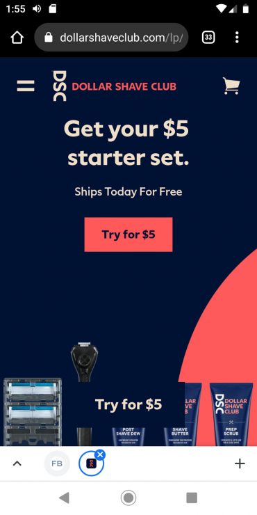
Check out the simple color scheme, the no-nonsense headline, and the crystal clear CTA: “Try for $5.”
There’s no confusion about what Dollar Shave Club wants you to do here. And with the subheading “Ships today for free,” it’s a hard offer to refuse.
If you’re not sure how to design a landing page for a trial offer, take inspiration from Dollar Shave Club and the B2B space.
Keep it short. Keep it simple. Keep it smooth.
8. Hunt-A-Killer
Not to bring personal opinions into this, but “Ditch the flowers and get mom a mystery” has to be my favorite Mother’s Day ad ever.
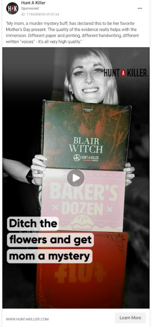
Hunt-A-Killer is an immersive murder mystery game told over the course of six “episodes,” which arrive at your doorstep in boxes.
It’s a great stay-at-home group activity, which makes it perfect for a family-oriented holiday like Mother’s Day.
The landing page is really what knocks this ad out of the park. “Kill It This Mother’s Day,” reads the headline.
The page is full of playful, purposeful copy, ending with the CTA “Put Mom on the case.”
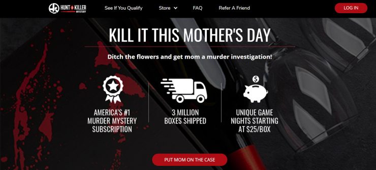
This is a great example of branded advertising that leans into an established playful, punny tone.
If that’s your brand’s vibe, roll with it! You can create some truly memorable landing pages this way.
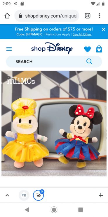
9. Buzzfeed with Disney nuiMOs
This ad sparks interest with an unusual image — Pooh Bear in a three-piece suit. Here, Buzzfeed partners with Disney to sell nuiMOs, a line of stuffed toys with swappable outfits.
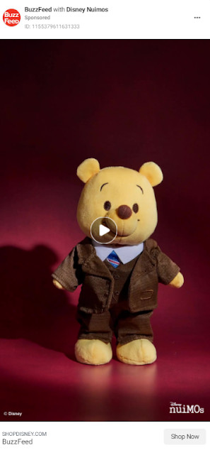
Both the desktop and the mobile landing page drop you on a carousel of photos, without a CTA button in sight. You do see a free shipping offer in the top banner and a search bar.
Once you scroll down, that’s where the magic happens. On mobile, you can “Discover More” to learn more about nuiMOs, or you can start shopping.
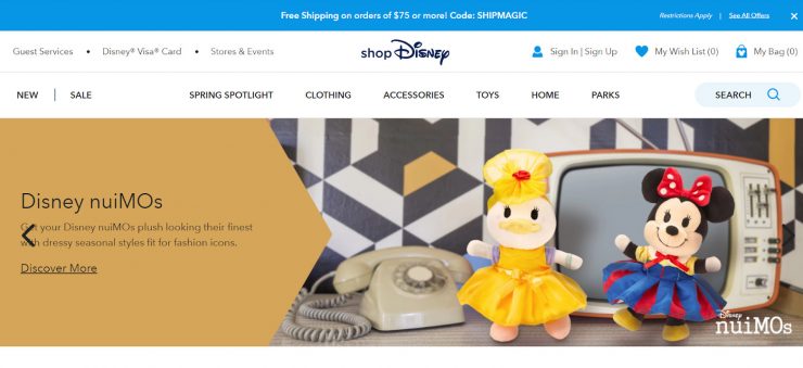
On desktop, you can press “Quick Shop” under your nuiMO of choice.
We tested it, though, and “Quick Shop” actually adds an extra step to the shopping process.
Since it’s Disney, we assume they know what they’re doing. You’ll probably want to make sure your own e-commerce page is streamline as much as possible.
Even so, there’s a lot to like here…the product staging, the offered discount, and the on-brand family atmosphere.
10. GEICO
The purpose of this ad is to convince prospects to sign up for a GEICO membership. They’re not just selling discounts, though.
Securing a place among the “Greek Life” members hearkens back to college days, for those of us went that route.
This is exactly what GEICO wants, since this membership is exclusively for members of partner Alumni Associations, Fraternities and Sororities, and more.
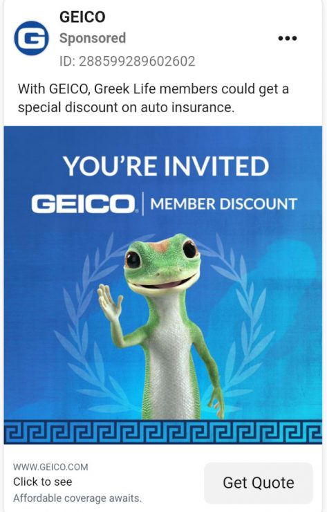
If you click “Get Quote,” your next steps are clear. You can search for your organization, enter your ZIP code, and get your quote.
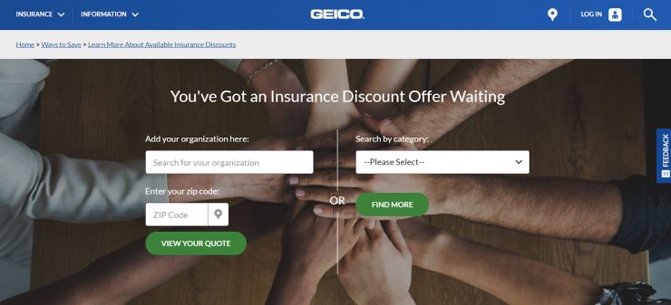
Memberships are powerful, since they sell you on a sense of community along with saving money.
If you’re running a promotion like this, your landing page should make it clear who’s invited, how to get started, and what to do next.
11. Old Spice
If you’ve seen the really weird commercial for soap, then you know Old Spice is comfy with off-the-wall brand messaging.
They keep it up with their Instagram ads. By three soap products and get free…socks? What? Why?
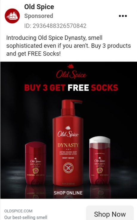
Then again…who can say no to free socks?
For such a weird ad, the landing page is remarkably straightforward. Buy any three products…get free socks. It is what it says on the tin.
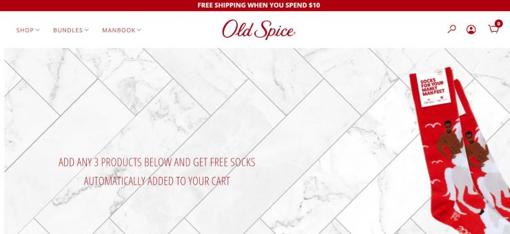
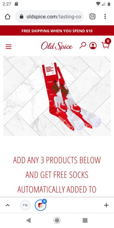
Scrolling down brings you to a carousel of products, each with a convenient “Add to Cart” button underneath it.
Wacky messaging is an effective way to disrupt the feed. If it fits with your brand’s vibes, take a leaf out of Old Spice’s book and try it out yourself!
Just make sure your landing page is as clear and well-designed as theirs, so your prospects don’t get lost in the bizarre message.
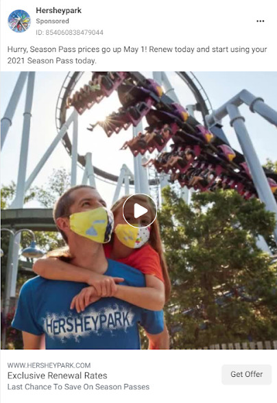
12. Hersheypark
Hersheypark is the official theme park of The Hershey Company, and it’s gearing up for the summer season. You know what that means. It’s time to renew your season pass!
Like all theme parks, Hersheypark has to stay sensitive to the global pandemic.
This ad taps into feelings of family and safety by showing a father and daughter fully masked up and ready to enjoy the day.
If you click “Get Offer,” you land on a page dedicated to renewing your season pass. A top banner restates Hersheypark’s commitment to safety.
If you scroll down, you learn that prices go up starting May 1. Further down, you can explore season pass options (and pick one before time runs out!)
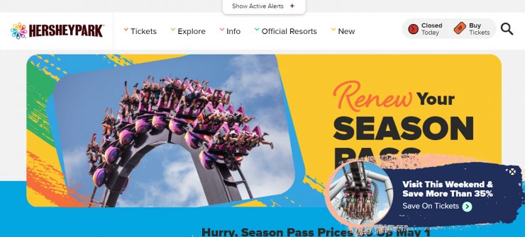
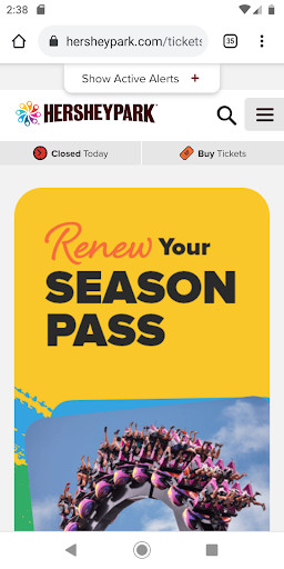
The Active Alerts banner is especially important because if customers don’t feel safe, they won’t buy. Even the best landing page in the world won’t change that.
13. Hulu
Did a Sasquatch murder three people in 1993? Well? Did it?
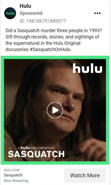
This ad uses curiosity to convince Sasquatch-loving prospects to hit the “Watch More” CTA. Once they do, they land directly on the Sasquatch documentary Hulu page. From here, prospects can watch the trailer, or jumpstart their free trial.
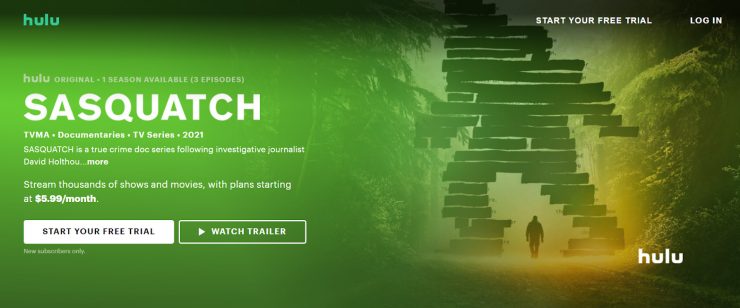
This landing page is especially strong because the prospect can get what they want after just a few clicks.
For people mindlessly scrolling through Instagram, stuck at home and desperate for something fun to do, this ad can fix their boredom immediately.
14. Netflix
Everyone likes to be the first. (Just check any YouTube comments section.)
In this ad, Netflix offers families exclusive entertainment by giving them the chance to be part of a virtual screening for a new action-comedy movie: The Mitchells vs. The Machines.
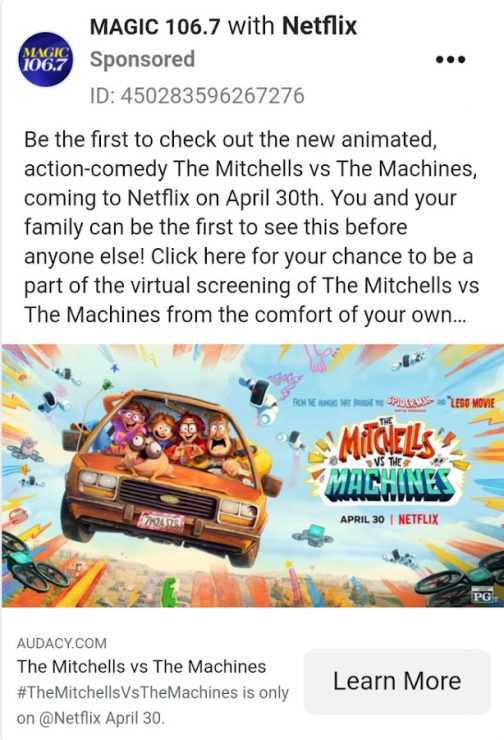
If you look closely, you’ll notice Netflix is sponsoring this ad through MAGIC 106.7, a commercial adult contemporary radio station.
Clicking “Learn More” brings you to a contest information page, hosted on the MAGIC 106.7 website.
From here you can read the contest details — only 5 winners will get exclusive access to this film.
The interesting part about this landing page is that it’s much less straightforward than others we’ve looked at.
There’s no big CTA or headline…instead, you have to scroll through the context rules before you find the link to enter.
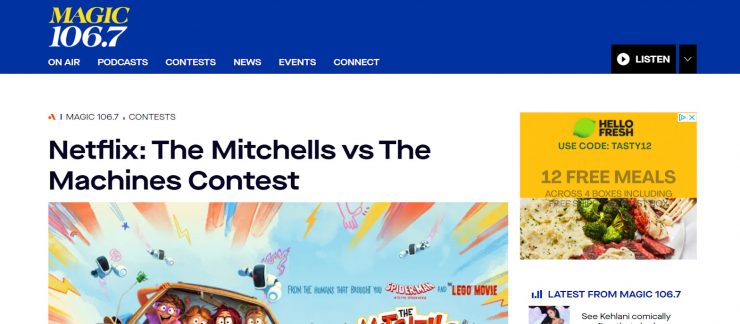
It would be fun to know the psychology behind this choice. Are people more likely to enter into a competition when they think they have a higher chance of winning? Or would a headline like “Win 1 of 5 Exclusive Virtual Tickets to The Mitchells vs The Machines” have brought in more leads?
It’s all worth considering if you’re running a contest of your own. It would be even easier to use an Instagram Direct ad here, and let participants enter by DMing you their email address.
15. Hubspot
Aha! You didn’t think you’d escape B2B landing pages so easily, did you?
As a leading developer of inbound marketing techniques, Hubspot’s own landing pages have a lot to teach us.
For one, the ad is clean and simple. Hubspot’s offering a free social media content calendar — a godsend to marketing departments everywhere.
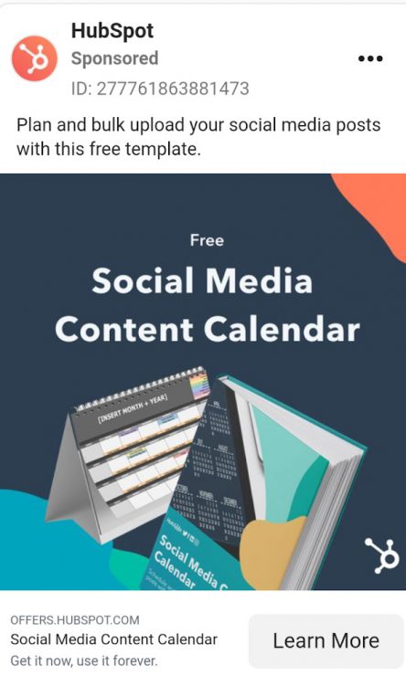
Clicking “Learn More” brings you to an equally clean landing page. The graphics are simple. The color scheme is simple. The CTA reads “Download Now for Free.”
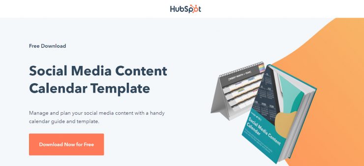
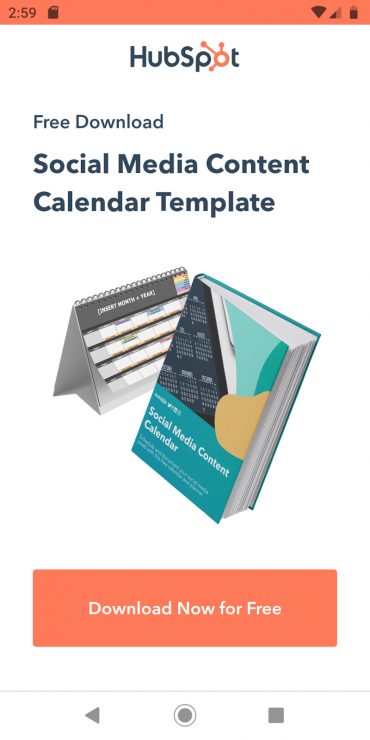
If you bite, Hubspot prompts you to enter a fair amount of info: your name, email, phone number, website, and some basic info about your company. You also have the opportunity to subscribe to Hubspot’s marketing blog (which, if you’re not already, you should be).
B2C landing pages probably don’t need to gather this much info about your prospects. Everything else is a fantastic template to copy.
No matter what you’re selling, think about who you’re targeting and what value you bring them. Then, say that in as few words as possible. Boom. Landing page done.
16. Semrush
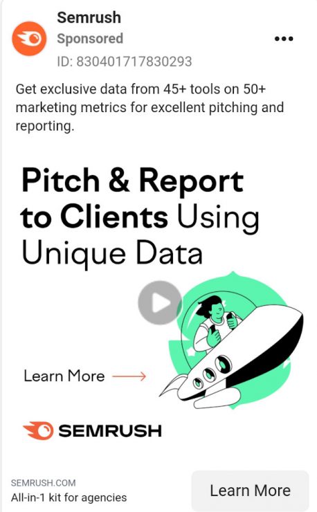
Another B2B giant who’s knocking it out of the park is Semrush, one of the most powerful keyword analysis tools available.
This ad targets agencies who rely on unique data to provide value for their clients. It’s a great example of writing ad copy that speaks directly to a specific audience.
Clicking “Learn More” brings you to a landing page with a CTA that immediately lets you choose your pricing plan.
That’s great for agencies who are already sold on Semrush — maybe they’ve heard of the company and seen their ads a few times — but those who need more info can scroll down to read about everything Semrush can do.
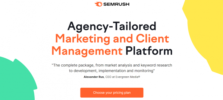
This is a strong format for a landing page, especially for an expensive product with a lot of value.
Make it easy for prospects to buy with a clear headline, social proof, and a bold CTA.
Then, describe your product in detail. Include examples and more social proof along the way.
By the time your prospect reaches the end of the page, they should know everything they need to know in order to buy.
17. TubeBuddy
TubeBuddy is another B2B tool…technically. It helps YouTubers identify keywords, manage their channels, and spy on competitors’ best practices.
But, it’s equally useful for big brands and influencers alike.
This ad taps into social proof from influencers who swear by TubeBuddy’s services.
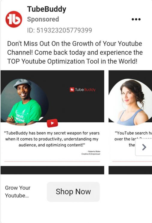
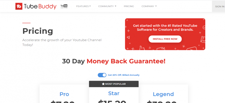
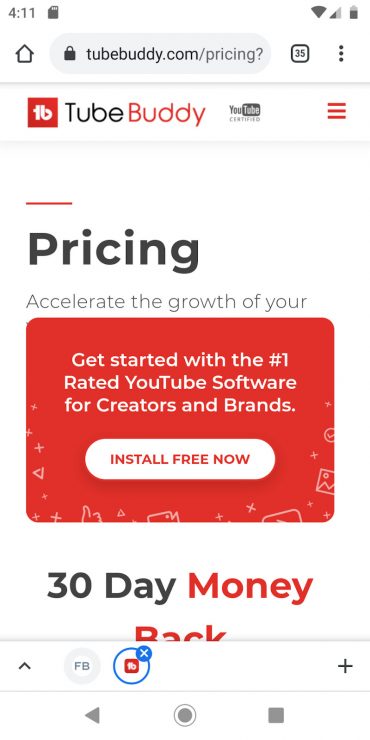
Click on “Shop Now,” and you’ll land on TubeBuddy’s pricing plans page.
The most prominent CTA is “Install Free Now,” which is a good idea — TubeBuddy’s free version offers a range of features to get content creators hooked.
If your product has a free version that naturally leads to paid subscriptions, that’s a great CTA to use on your landing page!
Free trials lead to higher customer satisfaction, after all.
18. Penguin Random House
Advertising books can be tricky, since books are all about an in-depth reading experience, and people hardly ever stop to read ads.
In this ad, Penguin Random House uses eye-catching imagery to stop the scroll. Then, the book’s title and the ad description pulls bookish prospects in.
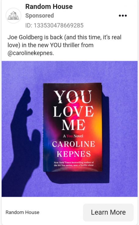
The CTA brings you right to the sales page for this book. Once you scroll down, it’s simple to buy.
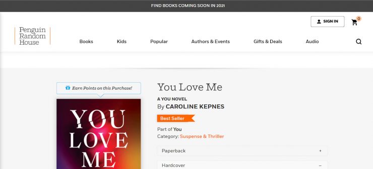
Stay on the page long enough, and a pop-up invites you to join Penguin Random House’s email list. That way, prospects who like this specific author can hear more about her books.
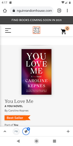
19. Shopify
Shopify is all about selling creative products, and their ads highlight that. I’m not positive what this little plant sculpture is made of, but I do know it looks awesome.
“Turn your hobby into a business” is a strong tagline, and the CTA “Sign Up” makes it easy to see what Shopify is selling here.
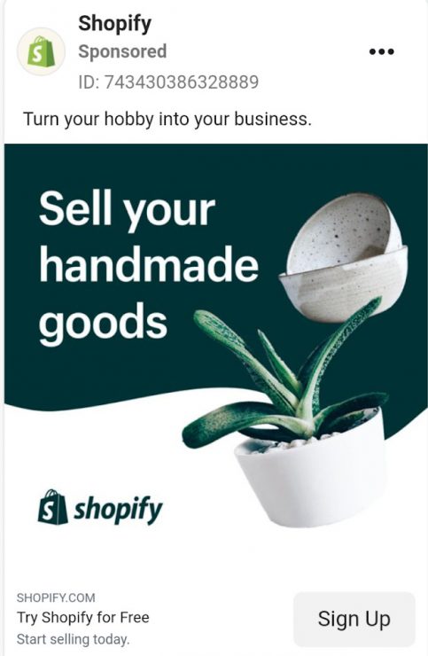
The landing page asks you to enter your email address and start a free trial. It’s one of the simplest landing pages on this list, and for that reason, one of the best.
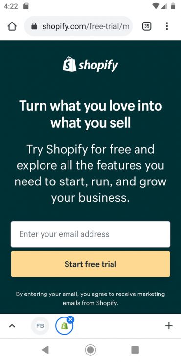
Scrolling down tells you more about Shopify’s features and offers some social proof. It might be a good idea to include a little more information on your own sales page, but then again, maybe Shopify’s user base likes to keep it simple.
Whoever your audience is, make sure your landing page speaks clearly to them — and them alone. Then, use the space under the fold to answer FAQs.
20. Ben & Jerry’s
On 4/20, Ben & Jerry’s took a break from selling ice cream.
Instead, they used their platform to voice their opinion on a social justice issue…and they used an Instagram landing page to get people to do something about it.
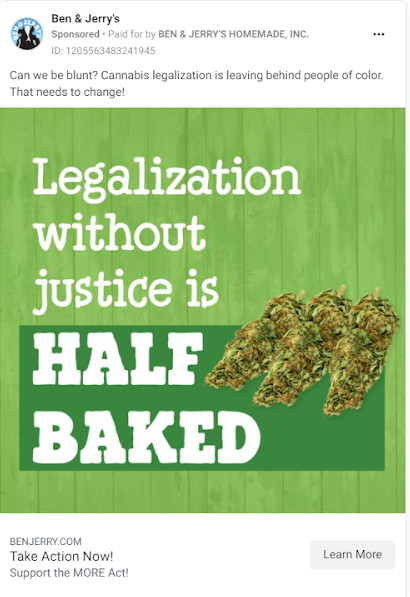
Clicking “Learn More” on Ben & Jerry’s ad takes you right to a page where you can sign up to support the MORE act.
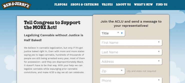
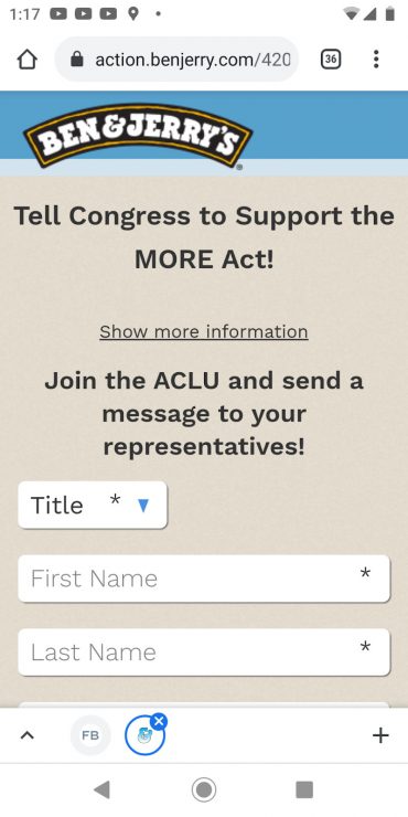
(Also, the page slug is /420, which is a nice touch.)
Social consciousness is more and more important to Instagram users everywhere. As a brand leader, you have the power to speak up on issues that matter to you and work with your followers to make a real difference.
21. Planet Fitness
Spring is here, and the world is reopening!
Gyms everywhere know it’s their time to shine, and Planet Fitness is taking advantage of this with their PF Black Card® membership.
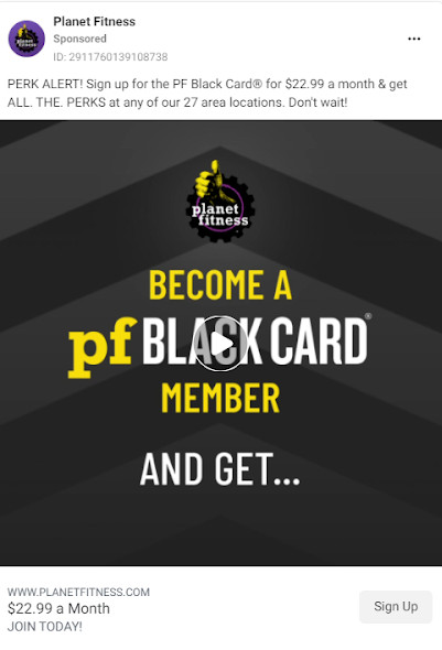
The CTA reads “Sign Up.” It brings you to a high-energy landing page with a catchy headline: “Burn calories, not cash!”
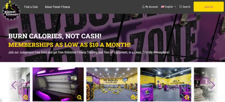
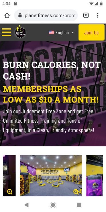
Planet Fitness uses this crucial space to advertise their low membership fees. The CTA “Join Us!” sits in the upper right corner, instead of under the headline like usual…but scrolling down gives you the option to sign up at a location near you.
If you’re advertising a chain with multiple physical locations, this is a great strategy to steal for your own landing page!
22. Society6
Instagram is a visual medium, so whenever you have the opportunity to make your ads pop…you go for it.
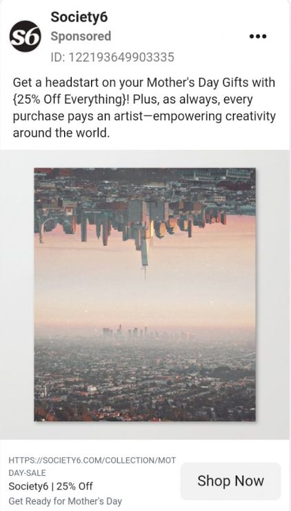
Society6 uses stunning user-generated content to stop the scroll. And they sell exactly what they show! Clicking “Shop Now” brings you straight to the product page for this print.
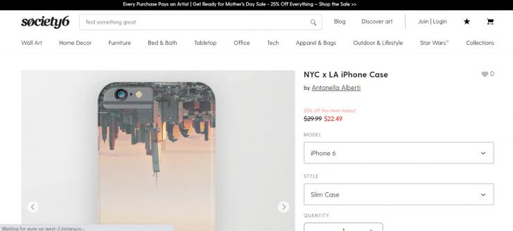
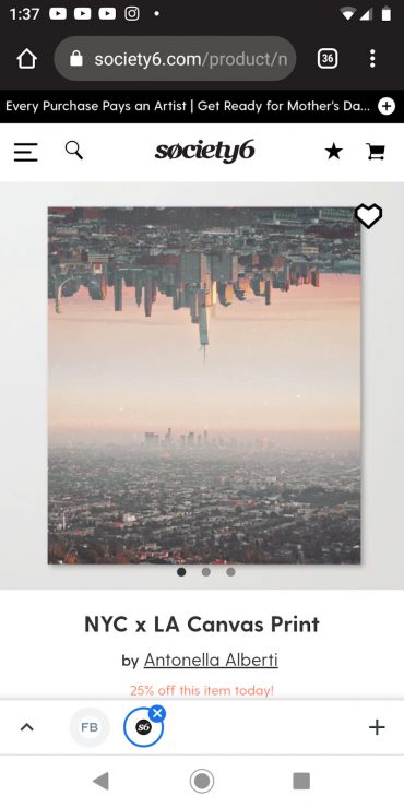
With the product, price, and “Add to cart” immediately in front of you, Society6 makes it uber-simple for customers to take the plunge.
23. Nintendo Switch
We’re all tired of being stuck inside. Although the spring weather and re-opening is (finally!) changing that, Nintendo offers the chance to adventure from home with the New Pokemon Snap game.
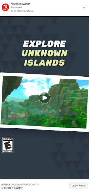
After the video reels prospects in with stunning imagery and nostalgic characters, the landing page urges them to watch the full trailer.
A banner at the top lets you skip to the game content if you want, and scrolling down announces an April 30 pre-order date.
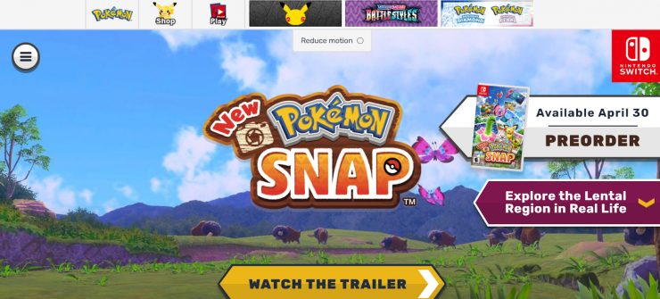
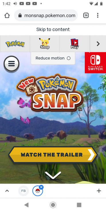
This landing page is a great example of making it easy for prospects to find what they want.
Whether visitors want to bask in the game’s graphics or get straight to the sales page, Nintendo makes it easy for them.
24. ColourPop
ColourPop takes the straightforward approach of showing off their product via video. This low-budget production value gives the ad a UGC feel…and that lowers users’ natural defenses against advertising.
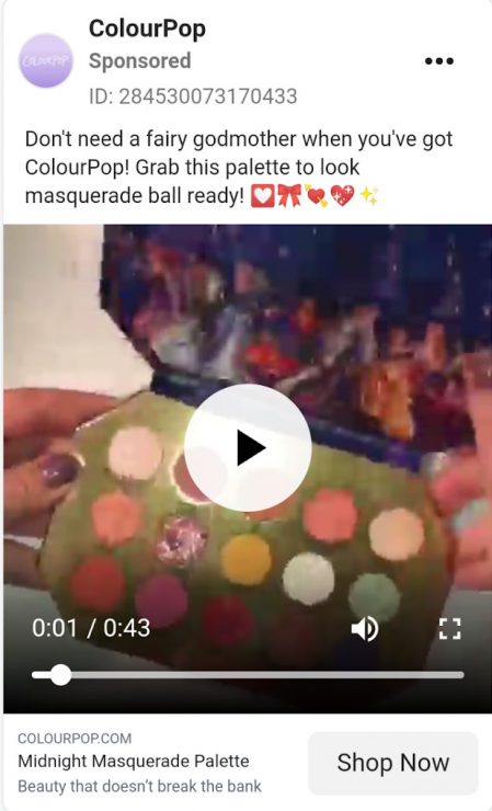
Clicking “Shop Now” brings you straight to the all-Disney eye shadow collection. The advertised product is first on the list.
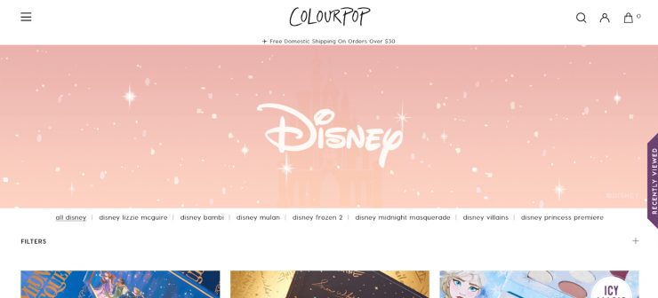
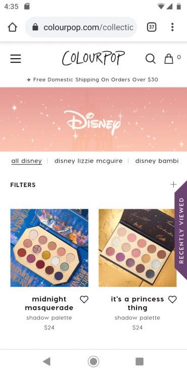
It only takes half a scroll to reveal the “add to bag” CTAs listed under each product. That makes ColourPop’s products easy to understand and easy to buy.
25. PlayStation
Like Nintendo, PlayStation offers a virtual exploration experience — but instead of building suspense for an upcoming relief, PlayStation wants you to make your escape now.
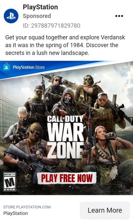
Clicking “Learn More” brings you to the PlayStation store. After a small scroll, PlayStation users have the option to download Call of Duty®: Warzone for free.
If players have their equipment at the ready, they can start right away!
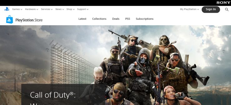
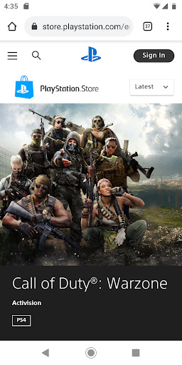
Like the other landing pages on this list, PlayStation eliminates friction for the user by making the landing page experience as smooth as possible.
So, what can you learn from the landing pages on this list?
- Know your audience. This affects what kind of landing page you send them to (product page, free download, Instagram Direct, and more).
- Know your product. What you’re selling is just as important as who you’re selling to. A product-focused landing page wouldn’t be effective if you want people to download a free guide.
- Keep it simple. Your goal should be to eliminate as much confusion as possible. Stick to your brand color scheme, show exactly what you’ve advertised, and display a clear CTA.
Several of these companies have products that are great candidates for Instagram Direct ads. Whenever you’re offering a discount or a special offer, getting your prospects to message you directly results in much better ROI.
To use Instagram Direct ads for your own product, you’ll need a way to handle a lot of messages at once.
When you use an automated message flow designed in Customers.ai, you can auto-reply to all conversations. This way, you scale your lead capture and decrease your cost per result.
In other words, you’ll get more leads…fast.
To experience what our Instagram beta tools can do, apply here to see if you qualify. Spots are limited, so check us out now!
GET EARLY ACCESS TO NEW INSTAGRAM TOOLS FROM Customers.ai
Get more Instagram followers with new tools for influencers, artists, brands and D2C businesses. Sign up to be the first to use tools that generate elite engagement via Instagram DMs.
Get Early Access